|


Click here
or scroll down for alternate versions, including
the original one from Lien's
tutorial.
Translated with
permission from the creator, Lien at X-clusive
Designz tutorial site.
 

See the original
tutorial here for PSP in Dutch
This
is not my tutorial, it belongs to Lien. If you
would like to translate into another language,
you must ask her permission.
You can contact
her here.
 
They will both open
in a new window and print out on standard 8½" X
11" paper
For
information about which fonts, programs, etc I
used to construct my pages and my headers,
click
here.
|
For this tutorial you will
need:
 or or 
I've done this
tutorial in PSP 9 and PSP XI.
I believe it
can be done in most versions.
You may have
to look around for the commands but it's likely
they are there.
Filters and materials
needed
No filters needed
Supplies in
zip file here.
Supplies in zip file here
for older versions if the other ones don't work
for you. These are in psd format.
All items
needed are supplied, including the tubes,
scrapkit and
font.
***********
Credits
Tube
art ©ArtMam: http://www.artmam.com/, misted
by myself
Other woman tube is tubed by Lien
of X-clusive Designz
Note from Lien:
Important!!! Please read carefully!!!
* The
scrap tubes used in this tutorial are bought by
me personally.
You may use these scrap tubes
for this tutorial, and for your personal use.
You may not share these tubes for sale,
trade, sharing, your own tutorials, or
commercial purposes.
Read carefully the
conditions of the scrap designers, otherwise I
may have to stop writing scrap tutorials!!!
Thanks for your cooperation.
***********
My plugin windows may look
different from yours as I use Filters Unlimited
2 to manage my plugins - available for purchase
here
http://www.icnet.de/filters_unlimited/
***********
I am assuming
you know the basics of Paint Shop Pro and where
the tools can be located. |
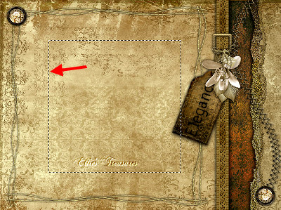
Here are some
arrows and bars you can drag and drop where you
need to mark or underline where you are. .
Just left click and drag to where you want
it then let go.
They will stay where you put
them until you close your browser.


Here's a small
version of the tag that you can drag with you
for reference
 |
Preparation
Before
opening PSP, double click the font to open it
and leave it open
so they will be available
for use in PSP (or install the fonts)
Now
open PSP. Open your tubes in PSP, duplicate them
(shift-D) and close the originals
None of the
tubes are used more than once, so each can be
closed after use.
When copying tubes, make
sure you are in the tube layer and not the
background or copyright layer. |
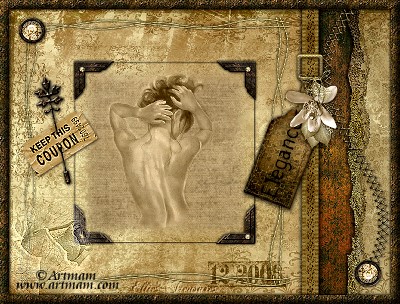
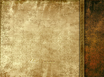
Step 1
Open a new
transparent canvas 640 x 480 |
Step 2
Selections>select
all (Control-A)
Activate Golden-elegance.jpg;
Edit>Copy (Control-C), Edit>Paste into
selection in working canvas
Deselect
(Control-D) |
Step 3
Activate
Golden-elegance-2.jpg
Edit>Copy
(Control-C), Edit>Paste as new layer
(Control-L)
Move it to the right, as shown in
example.
 |
Step 4
Activate
ge-ribbon
Edit>Copy (Control-C),
Edit>Paste as new layer (Control-L)
Move
it to left edge of the last paper you pasted, as
shown
Effects>3D Effects>Drop Shadow,
settings: H+V 1, Opacity 80, Blur 10-black.
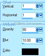
Repeat with H+V on
-1.
 |
Step 5
Activate
ge-torngold
Edit>Copy (Control-C),
Edit>Paste as new layer (Control-L)
Move
it to far right, covering the right edge of the
golden-elegance 2 paper, so that the torn edge
is visible. See my example.
Effects>3D
Effects>Drop Shadow, settings as before: H+V
-1, Opacity 80, Blur 10-black.
 |
Step 6
Activate
ge-golden-stiches
Edit>Copy (Control-C),
Edit>Paste as new layer (Control-L)
Move
it to the far right, so that the lower curve
touches the far edge, the upper curve should be
touching the edge of the ribbon, as shown.
Effects>3D Effects>Drop Shadow,
settings: H+V 1, opacity 50, blur
5-black.
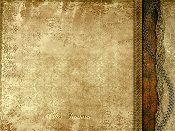 |
Step 7
Activate ge-gesp
(buckle for ribbon)
Edit>Copy (Control-C),
Edit>Paste as new layer (Control-L)
Move
it up and to the right, on top of the ribbon as
shown. Image>Resize to 98% to make it fit a
bit better.
Effects>3D Effects>Drop
Shadow, settings as before:
1-1-50-5-black
Repeat with H+V -1.
 |
Step 8
(do step 8 and 9
after the borders if you want to be able to
change the name on this tag later)
Activate
ge-tag,
Edit>Copy (Control-C),
Edit>Paste as new layer (Control-L) in your
working canvas
(put your name on the tag now,
if desired-Go to Image>Rotate>Free Rotate,
90 degrees right.
Set your background color
to black, turn foreground color off (click on
circle with line through it);
for the font I
used Burned Gothic, which I supplied, I added a
drop shadow of 0-0-80-10.).
Merge down to
attach it to the tag. Now rotate the tag back by
going to Image>Rotate>Free rotate, 90
degrees left
Move the tube to the ribbon
buckle.
Using your raster deform tool, hover
over it till you see the double curved arrows
and rotate your tag a bit as
shown.
Effects>3D Effects>Drop Shadow,
settings as before: : 1-1-50-5-black
Repeat
with H+V -1.
 |
Step 9
Activate
ge-bouquet
Edit>Copy (Control-C),
Edit>Paste as new layer (Control-L) in your
working canvas
Move the tube to the buckle,
placing it where you like it by the
tag
Effects>3D Effects>Drop Shadow,
settings as before: 1-1-50-5-black
Repeat
with H+V -1.
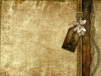 |
Step 10
Activate raster
layer 5 (your curved row of
stitches)
Activate
ge-stitch-frame
Edit>Copy (Control-C),
Edit>Paste as new layer (Control-L) in your
working canvas
Move the tube a bit left of
the middle, so it's centred between the top,
bottom, left and left edge of ribbon. See my
example.
Effects>3D Effects>Drop
Shadow, settings: -1, -1, 80, 5-black.
 |
Step 11
Activate
Button
Edit>Copy (Control-C),
Edit>Paste as new layer (Control-L) in your
working canvas
Move the tube to the upper
left corner of the stitch-frame.
Layers>duplicate layer.
Image>Mirror. Image>Flip to move it
down to bottom right edge as
shown.
Merge>merge down
Drop Shadow: 1.
1, 80, 5-black.
 |
Step 12
Activate your
eraser tool
Activate the ge-stiches layer
(the curved stitches) and erase the
bottom
part of the stitches from the button on down, as
shown in my tag |
Step 13
Layers - new raster
layer.
Activate your selection tool and
select a rectangle inside the stitch-frame,
big enough to go around the woman tube once
applied, about 300X330
(you can see your
selection size in the status bar at the bottom
of the psp program window).
See example of
frame around woman tube.
Drop shadow as before:
1-1-80-5-black
Repeat with H+V on -1.

Keep
selected. |
Step 14
Selections>Modify>Contract 20
pixels.
Selections>Modify>Feather 20
pix.
Activate Texture.jpg>Edit>Copy
(Control-C),
Layers>New raster
layer
Edit>Paste into
selection
Deselect.
In the layer
palette, move opacity slider to 76

In the screenshot of the
layer palette, you will see two layers above it,
this is because I'm keeping my tag and
bouquet at the top as I want to save it in
layers, so I can change the name on the tag
more easily later if I want to.
 |
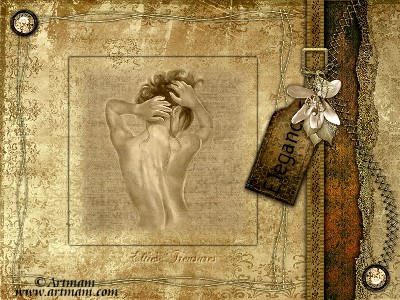
Step 15
Activate the woman
tube (you have a choice of two women tubes, I
used the ArtMam one, Lien used the ge-woman
one)
Edit>Copy (Control-C), Edit>Paste
as new layer (Control-L) in your working
canvas
Move the tube to the middle of your
drop shadow frame.
Set the Blend Mode in the
layer palette for this layer to Luminance
(Legacy)
 |
Step 16
Activate
ge-hoek-onder (bottom right
corner)
Edit>Copy (Control-C),
Edit>Paste as new layer (Control-L) in your
working canvas
Put this tube on the bottom
right corner of the shadow
frame
Layers>duplicate layer.
Image>Mirror
Put it on the bottom left
corner
Layers>Merge>Merge
down |
Step 17
Activate
ge-hoek-boven (top left corner)
Edit>Copy
(Control-C), Edit>Paste as new layer
(Control-L) in your working canvas
Put this
in the top left corner of the shadow
frame
Layers>duplicate layer.
Image>Mirror
Put it on the top right
corner of the shadow
frame
Layers>Merge>Merge down
Repeat merge down twice. (all corners will
then be in the same layer).
Drop shadow: H+V
1, opacity 80 and blur 5-black.
Repeat with
H+V on -1.
 |
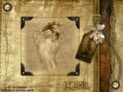
Step 18
Activate the tube
"ge-datum" (the numbers)
Edit>Copy
(Control-C), Edit>Paste as new layer
(Control-L) in your working canvas
Put in the
bottom right corner of the stitch frame and pull
the layer below the stitch frame layer (which
should be raster 9)
In the layer palette, put
the blend mode on Luminance (Legacy) and the
opacity at 80

 |
Step 19
Activate your top
layer
Activate the tube "ge-coupon"
(ticket)
Edit>Copy (Control-C),
Edit>Paste as new layer (Control-L) in your
working canvas
Move it a bit to the left,
over left edge of shadow frame, as shown
Drop
shadow: H+V 1, opacity 80 and blur 5-black.
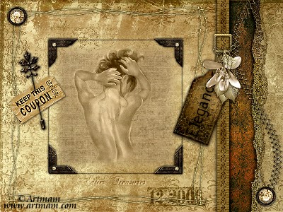 |
Step 20
Activate
ge-flower
Edit>Copy (Control-C),
Edit>Paste as new layer (Control-L) in your
working canvas
Move it to the bottom left
corner of the tag
In the layer palette, put
the blend mode on Luminance (Legacy) and the
opacity at
76
Adjust>Sharpness>Sharpen
 |
Step 21
Make sure all tubes
are where you want them; when satisfied, merge
all.
(If you want to be able to change the
text on the tag, cut (Control-X) and paste
(Control-L)
the tag and the bouquet charm on
top of it to another canvas while you merge and
add the border,
copy them back in
later)
Image>Add borders>15 pix white.
Select the border with your magic
wand
Make sure your "gg-scrap-patroon" is
open and minimize.
In your material palette,
set to pattern and find the "gg-scrap-patroon",
set angle at 0, and scale at 100.
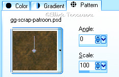
Fill your
selection with your bucket flood fill
tool. |
Step 22
Effects>3D
Effects>Inner bevel, settings: bevel 1,
3-50-5-8-20-315-35-30-white
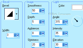
Drop Shadow: H+V
1, opacity 80, blur 5-black.
Repeat with H+V
on -1.
Deselect.
Do steps 8 & 9
(tag and flower charm) now if you skipped them
earlier.
Your scrap tag is
ready!
Add the copyright layer, Watermark and
save |
Resizing
To resize,
make sure, to retain the texture and the
clarity, resize at 90% bicubic and repeat till
you get close to the size you want.
At that
point you can resize by pixels as usual. You
will find this makes a big difference in your
final result,
especially of the texture of
the weave in the border, which will go all funny
if you resize all at once.
If you resize, use
the unsharp mask or Brightness/Contrast to
sharpen it a bit.
Adjust>Sharpness>Unsharp mask at
Radius 1, strength 60, clipping 4.
or
Adjust>Brightness and Contrast set
to Brightness of 5-contrast of 15. |
Watermark, add copyright,
and save
Layers>New raster layer. Add
your water mark on this new layer
To add
copyright, add another new raster layer and use
a font that's clear at small size (I used Cally
CE for the one in my tag)
foreground color
off, background color black or another dark
color.
You can make the copyright symbol by
holding down the Alt key and typing 0169 IN
THE NUMBER PAD (This is important)
If
this doesn't make a copyright symbol, you'll
need to choose another font, not all fonts have
the symbol.
This normally doesn't work on a
laptop as it has no separate number pad. In this
case, I use the Character Map that comes with
Windows.
Start
button>Programs>Accessories>System
Tools>Character
Map
Layers>Merge>Merge all
(flatten)
Save: File>Export>Jpeg
optimizer - compression of 20. |
l
hope you had fun!
Back
to top |
Translated by
Ellie on June 29,
2008
******************
These tutorials
are translated with permission from the original
writer.
Any resemblance to any other tutorial
is purely coincidental and unintentional.
Feel free to share any of my tutorials on
this site by a link back to my site,
but do
not copy and send the entire tutorial to anyone
or any group.
©2003-2008 Ellie's
Treasures
|
| If
you have any questions or suggestions, click on
the email button below to contact me. Have a
wonderful day! |

 |
Alternate versions
Made by Lien in her original
tutorial

Made by me with my
name on it.
I used the font Burned Gothic,
all lower case, black, then in PhotoImpact I
applied a preset called Concrete 2
It may
work for you in PSP applying the blend mode
Screen or do it as you did the small tag in step
8 with a blurry shadow
Made by my friend,
Sonel of Sonel's Corner
 |
|
Back
to top
Webpage Design
Information
This webpage
background was made in PhotoImpact with a
tutorial by Deb
DeHaven
Sadly, she passed away but
her tutorials just came back online, thanks to
PIRCNet.
You can find the tutorial
here.
The font I used for all of
the text on the buttons is BrockScript
The
font I used for the "Grungy Elegance" tutorial
header is Burned
Gothic.
Click on the font name to
download the font.
I use PhotoImpact to make
all of my headers due to the amazing
3D text
it has and the wonderful presets available free
online
Most of the presets I use
are either the ones that come with PhotoImpact,
usually the Gel ones,
or from Deb's PI
Tutorials and More (see below) or
Carol Oyl's
site
This is the address to
Deb's old pages
http://www.fortunecity.com/skyscraper/millenit/1716/pitutorials/objects/presets/presets1.html
I can't find any links to
her new pages but the presets are still on this
page for download.
For more sites
to find PI Presets, take a look at
my Great
Beginnings
page. |
