|


Click here
for an alternate version
Translated with permission from the
creator, Violette at Violettegraphic tutorial
site.
 

See the original
tutorial here for PSP in French
This
is not my tutorial, it belongs to Violette. If
you would like to translate into another
language, you must ask her permission.
You
can contact her here.
 
They will both open
in a new window and print out on standard 8½" X
11" paper
For
information about which fonts, programs, etc I
used to construct my web pages and my headers,
click
here.
|
For this tutorial you will
need:
 or or 
I've done this
tutorial in PSP 9 and PSP XI.
The original
writer wrote it in PSP X2
I believe it can be
done in most versions.
You may have to look
around for the commands but it's likely they are
there.
Filters and materials
needed
No outside filters
needed
Supplies in zip file here
for version 8 and up
Supplies in zip file here
for older psp versions has .psd tubes instead of
pspimage. these can be opened in any
program.
Supplies include scrap kit,
pspselection (or either psp or psd file in a
layer to use with the older programs) and font.
You also need three tubes of couples of your
choice.
*************
Credits
The
scrap kit is called Kisses and was made by
Melissa from Scrappy Expressions (group now
gone).
The couples tubes I used are from AKK
(Karen) and Vicky. I have no site address for
either one.
************
I am assuming you
know the basics of Paint Shop Pro and where the
tools can be located. |
Here are some
arrows and bars you can drag and drop where you
need to mark or underline where you are. .
Just left click and drag to where you want
it then let go.
They will stay where you put
them until you close your browser.


Here's a small version of
the tag that you can drag with you for
reference
 |
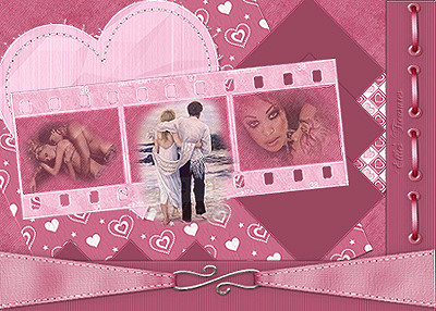
1 - Preparation
Open
your tubes, duplicate them (shift-D) and close
the originals.
I always open all of my tubes
and close as I use them
None of the
tubes are used more than once so they can be
closed after use.
I also keep a copy of the
tag example open to refer to.
Save mine from
the top of the page and keep it open if you
would like to do this or drag the one just
above.
Put the pspselection file in your
selections folder. |
2 - Open a transparent canvas
of 700 X 500 pixels
3 - Activate the png file
SE_Kisses_Paper 3
make this a pattern in
materials palette and fill your background
 |
4 - Activate the png file
SE_Kisses_Paper 4
Edit/Copy/Edit/Paste as
new layer
Image/ Free Rotate 25° left


Effects/3D Effects/Drop
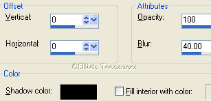
Shadow: 2/2/60/1/color #673f4b

 |
5 - New raster
layer
Selection/Load-Save Selection/Load
Selection from disc
Choose the selection
"vyp_sel_valentin.PspSelection"

Fill with color #c66281
(dark rose)

If you're using an older
version of windows, open either the selection
psp file or psd file.
This is simply a layer
that's already filled with the right color. Copy
and paste onto your scrap like any other layer.
If you want to change the color, just select
it and fill it with the new color or use the
colorize function in Hue and
Saturation.
Effects/ Texture
Effects/Blinds, settings: 2-40-light from
left/top checked, color #5a1f31:


Effects/3D Effects/Drop
Shadow: -2/-2/60/1/color #673f4b (same color as
before)

 |
6 - Activate the png file
SE_Kisses_Paper 2
Edit/Copy/Edit/Paste as
new layer
Image/resize to 50%, make sure that
"resize all layers" is not checked
Image/
Free Rotate 45° right
Place as shown, also
move layer two, the other diagonal paper, until
it's in a similar position as shown. I try and
use landmarks as I go, looking where various
patterns are so I can line them up as
shown.
Pull layer 4, the smaller paper, below
layer 3 (the filled selection layer) in the
layer palette, so that the right corner of it
disappears behind the selection
Effects/3D
Effects/Drop Shadow: 2/2/60/1/color
#673f4b
 |
7 - Open a transparent canvas
of 175 X 175 pixels/ fill with color #9a4760
(very dark rose)
Edit/Copy/Edit/Paste as new
layer
Image/ Free Rotate 45°
left
Effects/3D Effects/Drop Shadow:
0/0/40/5/color black
Duplicate layer twice
and place as follows, with right points just
touching selection edge, spaced evenly:

Pull raster 3, the
selection layer, to the top again.
Turn off
all layers but the three solid diamonds you just
made
(click the eye of each layer in the
layer palette to turn it off).

Merge visible.
Turn
other layers back on.
Duplicate merged
layer.
Image/ Free Rotate 90° left
Place
at bottom, under raster layer 3, with the top
points just showing

Go back to diamonds along
side and apply a drop shadow of 1-1-60-15
black
Now go to the layer with the points
along the bottom and apply a drop shadow of
0-3-60-10 black |
8 - Activate the
SE-Kisses_StitchedHeart.pspimage
tube
Edit/Copy/Edit/Paste as new
layer
Effects/3D Effects/Drop Shadow:
2/3/40/5/color black
 |
9 - Activate the
SE-Kisses_pagestrap.pspimage
tube
Edit/Copy/Edit/Paste as new
layer
With the lasso selection tool set at
point-to-point and add select around the ribbons
as shown
 |
10 - Adjust/Hue and
saturation/Colorize, 243-120:

Deselect |
11 - Move the ribbon to the
bottom, on top of the selection.
Activate
the raster deformation tool and reduce the size
by clicking on the top little box
and
holding the left mouse button down, pull it down
till the ribbon is about this size

Effects/3D Effects/Drop
Shadow: 0/0/60/25/color #673f4b
 |
12 - Activate the
SE-Kisses_EyeletRibbon.pspimage
tube
Edit/Copy/Edit/Paste as new
layer
Image/ Free Rotate 60° left
Activate
the raster deformation tool and reduce the size
by clicking on the top little box
and
holding the left mouse button down, pull it down
to the right size, now do the same thing using
one of the side boxes,
till you get a stitch
that's small enough to go down the length of the
selection 4 times, stopping just above the
ribbon

Effects/3D Effects/Drop
Shadow: 0/0/60/25/color #673f4b
Duplicate three times and
place in a line on the right side as shown.
I use the down cursor (arrow) key to move
them down in a straight line so they line up
evenly.
 |
13 - Activate the
SE-Kisses_Filmstrip.pspimage
tube
Edit/Copy/Edit/ Paste as new layer (or
see step 19)
Image/ Free Rotate 18°
right
 |
14 - Using your Magic Wand set
at add, hold down the shift key and select the
insides of the frames of the filmstrip
New
raster layer
Selections/Modify/Expand 2
pixels
Activate SE-Kisses_Paper 3
Make
it your pattern in the material palette and fill
your frames
Layers/Arrange/Move down (or drag
in the layer palette below the filmstrip
layer)
 |
15 - Making sure you are in the
filmstrip layer, select the interior of frame
1
New raster layer (so you can move it around
to get the best effect)
Activate one of your
tubes
Edit/Copy/Edit/Paste into the
selection

Deselect |
16 - Repeat with the two other
tubes of your choice
I reduced the opacity of
the tube in frame 1 to 44 and the one in frame 3
to 50, and for the center one, it distorted the
tube as it was a tall picture rather than wide,
so I reduced the size and pasted as a new layer
rather than into the selection and let it walk
into the frame. I liked the look so I left it
like that. You can paste into the selection as
the other two frames if you like. Be
creative!
 |
17 - Highlight the layer of the
filmstrip:
Effects/3D Effects/Drop Shadow:
5/5/60/25/color black
 |
18 - Turn off all of the layers
but the couples, the filmstrip and the paper
fill for the filmstrip. Merge visible
Turn
all layers back on. Move it to where you like it
and/or rotate it more up or down if you like.
|
19 - Alternatively to pasting
the filmstrip into the scrap and then filling
it, you can fill it with the paper
and the
couples tubes on the separate canvas, then merge
visible, Edit/Copy, Return to your
scrap
Edit/Paste as new layer and free rotate
a little towards the right.
If the couples
aren't going in as straight as you like, then
before you fill it, free rotate the filmstrip
24° right, this will make it level, after
filling and merging visible, free rotate a
little to the left, maybe about 6° |
20 - Activate the
SE-Kisses_SilverHearts.pspimage tube
With the
selection tool cut out the small heart at the
top right
Edit/Copy/Edit/Paste as new layer
into scrap
Adjust/Hue and
saturation/Colorize, 243-120:
This will turn it a pale
silvery pink
Resize to 75%, make sure
that "resize all layers" is not checked.
Lay
out in a line by duplicating it 4 times, and
placing 5 on the left side of the ribbon as
shown
To get the line even and in the right
place, I placed the extreme left one first,
about the middle of the ribbon, then I
duplicated one and using the arrow key, I moved
it to the narrowest part. If it's in the right
spot, I duplicated it and moved it left, with
the arrow key, duplicated that one, and moved it
left with the arrow key, and then once more for
a total of 5 hearts
If you always use the
arrow keys to move, they'll stay in a straight
line

Turn off all layers
except those of the hearts
Merge
visible
Duplicate/Image/Mirror

Apply the drop shadow -1,
2, 60, 5 black on the heart on the right side of
the ribbon,
for the drop shadow for the left
hearts change the horizontal to -2 and leave the
rest the same
 |
21 - Activate the
SE-Kisses_Bow_1.pspimage/Resize tube to
60%
Edit/Copy/ Edit/Paste as new layer into
scrap and to place to your taste, free rotate
20° left
Apply drop shadow 0/0/60/25/color
#5a1f31

********************
Make sure
that all is where you want it, that you have all
of your drop shadows done, etc, then merge
all
Until you merge, you can always add drop
shadows and fix things up, after that no way so
make sure it's all as you like it.
I always
merge at the last possible moment so I can fix
things but you have to merge here to add the
borders in the next step. |
22 - Image/Add borders: 2
pixels color #dfa9bc (medium rose)
 |
23 - Image/Add borders: 22
pixels color #9a4760 (dark rose)
Select with
the magic wand
Effects/Texture
Effects/Blinds, settings 2-40-black-horizontal
and light from left/top both checked:


Deselect |
| 24 - Image/Add borders: 2
pixels color #dfa9bc |
25 - Selection/Select
All
Selection/Modify/Contract 26 pixels
Effects/3D Effects/Cutout:
0/0/100/40/black
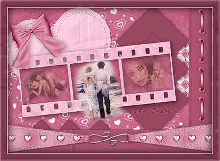 |
26. Add text if desired. I
wrote "Be my" and then "Valentine" on 2 separate
layers
using the font Buffet Script, size
26, stroke width 1, centered;

I did it on two layers as
the spacing between the two lines was too large
with this particular font and I wanted to move
them closer together. In the material palette I
put the dark rose from the border in the
background and turned off the foreground
color.

After applying the text,
right click in layer palette and convert to
raster layer.
If using more than one layer
for the text, turn off other layers and merge
visible.
Free rotate 10° left to match slant
of heart

Apply drop shadow of
1-1-100-0 black, if desired. I tried it both
ways and liked it better without the drop
shadow.
Merge all |
Resizing
To resize,
make sure, to retain the texture and the
clarity, resize at 90% bicubic and repeat till
you get close to the size you want.
At that
point you can resize by pixels as usual. You
will find this makes a big difference in your
final result.
If you resize, use the unsharp
mask or Brightness/Contrast to sharpen it a bit.
Adjust>Sharpness>Unsharp mask at
Radius 1, strength 60, clipping 4.
or
Adjust>Brightness and Contrast set
to Brightness of 5-contrast of 15. |
Watermark
Layers>New
raster layer. Add your water mark on this new
layer
Layers>Merge>Merge all
(flatten) |
Save
File>Export>Jpeg
optimizer - compression of 20. |
l
hope you had fun!
Back
to top |
| If
you have any questions or suggestions, click on
the email button below to contact me. Have a
wonderful day! |
These
tutorials are translated with permission from
the original writer.
Any resemblance to any
other tutorial is purely coincidental and
unintentional.
Feel free to share any of my
tutorials on this site by a link back to my
site,
but do not copy and send the entire
tutorial to anyone or any group.
©2003-2008
Ellie's Treasures
|

 |
Alternate
version

Made by my
friend, Sonel of Sonel's
Corner |
|
Back
to top
Webpage Design
Information
This webpage
background was made in PhotoImpact with a
tutorial by Deb
DeHaven
Sadly, she passed away but
her tutorials just came back online, thanks to
PIRCNet.
You can find the tutorial
here.
The font I used for all of
the text on the buttons is BrockScript
The
font I used for the "Scrap Valentina" tutorial
header is GE
Ragged Script.
Click on the font
name to download the font.
I use PhotoImpact
to make all of my headers due to the amazing
3D text it has and the wonderful presets
available free
online
Most of the presets I use
are either the ones that come with PhotoImpact,
usually the Gel ones,
or from Deb's PI
Tutorials and More (see below) or
Carol Oyl's
site
This is the address to
Deb's old pages
http://www.fortunecity.com/skyscraper/millenit/1716/pitutorials/objects/presets/presets1.html
I can't find any links to
her new pages but the presets are still on this
page for download.
For more sites
to find PI Presets, take a look at
my Great
Beginnings
page. |