For this tutorial you will
need
Corel Paint Shop Pro - available for purchase and
trial version here
OR
Corel Paint Shop Pro Studio,
available here
(I did enough of it in Paint Shop Pro
Studio to know that the steps are the same as PSP,
but I really
dislike that program and I'm not sure if I will be using it
again.)
You will also need Corel Animation Shop -
available for purchase and trial version here
Animation Shop used to come with Paint
Shop Pro before version X when Jasc owned it,
but now it's a
separate purchase. You can use any other animation program that you
have as well.
This may seem like a lot of steps and there's
lots to do to complete the calendar, but it's not hard.
And once
done, you can save as a template to reuse many times
over.
Filters and materials needed
A tube, psd
file, or graphic
No filters needed
I am assuming you know
the basics of Paint Shop Pro and where the tools can be
located. |
|
Here are some arrows you can drag and drop where you
need to mark your spots.
Just left click and drag to where you
want it then let go.
They will stay where you put them until you
close your browser.
        |
|
Let's Get
Started!
For your ease
in getting to various parts of the tutorial, here are some
links
Getting started: setting up the grid, just below
Adding
the numbers and text
Deciding
size and layout of calendar
Adding
the grid to a larger canvas
Adding
the blinkie lines
Make
1 or 2 more frames (2 more is the best)
Animation |
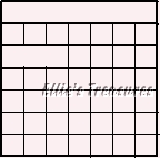
| MAKING THE CALENDAR GRID |
Setting up the
grid
1. Open a new white canvas, you can change
this color later.
2. Decide what size you want your grid to
be.
Make allowances for the fact that you'll be adding a border,
possibly a tube at the side or top outside the grid so don't
make it too large.
A good size is 140 wide and 120 tall if you
are not adding the month to the grid.
140X140 if you are adding
the month inside the grid.
You will use multiples of 7 across and
6 down and adjust the grid accordingly
Normal month will be 4
1/2 weeks, and 7 days, of course LOL, Your grid will always be
7 across.
add one row for the DOW initials that makes it
(usually) 6 rows by 7 columns
If you want to have the month
enclosed in a box right at the top that will be 7 rows tall instead
of 6.
(you can add the month and year outside of the grid at the
top of the canvas you will be switching to later)
If your month
is spread across 6 weeks, such as April is this year, you will need
to make it one row taller,
7 for grid without month, 8 if you
need a box for the month at the top.
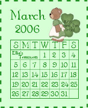
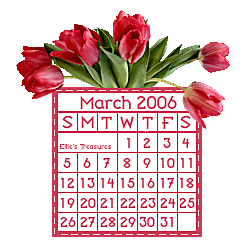
(see April calendar at the
top to see what I mean)
to make any other size, just use
multiples of 7 across and 6 down and make the grid that size
I
made mine 120X140 (6 rows down, 7 across, 20X20 each, no row for the
month)
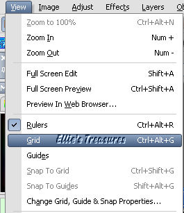
3. Go to View>Change Grid, Guide and Snap
Properties
Set the grid to 20X20

This is what your canvas should look
like
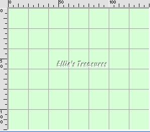
Zoom in.
You will be doing most of the work zoomed in for better
control. |
4. Picking the
colors
Pick 2 colors, 1 for background, one contrasting
for grid, text and numbers
Fill the canvas with the color you
want for the calendar background or leave it white.
You could
also use a gradient, a texture or a pattern here (very soft and
subtle so you can still read the text)
|
6 Drawing the grid
lines
Create a new raster layer
Click on the pen
tool, solid line, width 1, foreground color whatever you choose for
line,
mode-draw lines and polylines, anti-alias unchecked,
create on vector unchecked, show nodes unchecked.
Make sure the
color you want to use for these is the foreground color.

Draw across and down following the
grid lines. Don't do the second line down and the borders yet.
The lines should snap to the grid, helping to keep them
straight.
Another trick, if you are having a problem, is to hold
the shift key down as you draw and it will keep the line straight.
This works in any graphics program, at least all I have tried.
This is actually very easy and very quick, only takes a minute
or two.

New raster layer.
Change the width of the
pen tool to 1.5 and do the second line down.
Just above this is
where the days of the week will appear.
If you are adding a month
row on top of the grid,
also put this heavy line right under
where the month will be.
 |
7 Adding the
borders
New raster layer, now draw the borders around the
entire grid with the pen tool set at 1.5 pixels.
If you add a
border by going to Image>Add border, it will merge the layers, so
we have to draw the lines.
I added a new raster layer before I
did the outside borders,
in case I wanted to change the width or
color or line style of the border
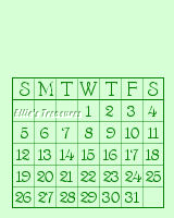
Since March starts on a Wednesday, I
could have left the first three
boxes blank like this, to add my
name to.

If I had added a row for the month/year,
it would look like this now.
Your grid's done
Save this template,
in layers so you can use it as a template
and change colors and
resize for other calendars |
|
Back to top |
| ADDING THE
NUMBERS AND TEXT |
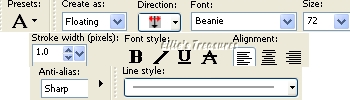
1. Click on the text tool and
pick a font and color
Alignment left, direction down,
anti-alias sharp, stroke width 1,
create as floating, line style
solid, all others left at default.
Create a new raster layer.
Pick a color for the
font, make it the background color in the palette and
click off
the foreground color (pick the circle with the line across it)

Pick a font that is easy to read at small
sizes. You can use a simple font, such as Arial.
You can use a
fancy font as well. Experiment to see if it is readable at the 100%
size of the calendar.
This will be at the true size of the
calendar and you will see very easily if it's readable at that
size.
Keep in mind that with the calendar zoomed up to work
on it, the text will look funny,
blurry and out of focus. Reduce
to actual pixels to see how they will look at the right size.
You may have to try out a few before you find what you
like.
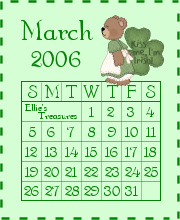
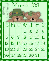
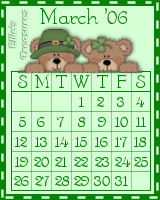
I used BENTLEY (for the 2 different March bears
calendars).
I used the same color as my grid and font size of
20.
You may have to go bigger or smaller depending on the font
used.
Some are very large and some are tiny.
I check out
some text and some of the larger numbers, like 39, 27, etc
to see
how the font will work in the squares.
Also, keep the numbers
fairly small, don't fill up the whole square or it will look too
crowded.
Use your judgment here.
You will be adding the
days across the top first.
Click on the text tool
Click on
where you want the text to be and a text box will pop up.
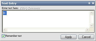
I check the box to remember text, especially
at the beginning
when you are experimenting with fonts and
sizes. Just type and see how it looks.
I typed the letter S for
Sunday first and then I just right clicked
on the layer and
duplicated it, moved it to the Sat position.
You can do the same
for Tues and Thu but it's up to you, it's not that much work to type
one letter! LOL
If you like it, click on ok and move it to
where you want it.
You can use the arrow keys to move it around
as well, for fine-tuning.
Defloat or select none (Control-D).
Repeat for all of the text.
Same method for all of the numbers
as well. I also use a new layer for each
so I can move them
around if needed or remove and replace. A lot of layers but it pays
off.
It helps to turn your grid back on, set at 10X10, to
help place the letters and numbers more
precisely.

Your calendar portion is done.
Save as
a psp or psd file in layers, and then merge all. |
| Back to top |
|
CREATING THE
REST OF THE CALENDAR |
|
Deciding the size and
layout of your calendar
You are now going to open a
new blank white canvas the size you want this part of your calendar
to be.
This includes the grid and rectangle around which the
blinkie lines will be flashing.
But first you have to decide the
layout of the finished calendar and the size.
The size will
vary whether you enclose the whole calendar within the blinkie
borders,
adding tubes to the top and/or sides or adding tubes to
the canvas outside of the blinking lines.
You do need to add an
area at the top to place the month and year,
if you haven't
added them to the grid as explained above.
If you have
added the extra row to the grid for your month and year,
you can
even stop here and just go to the section for type 3
where you
add the border, and don't continue on to put it on a larger canvas
(click
here)
I imagine you will probably want to add more
though!
You must copy and paste the grid into the new canvas
BEFORE you add the blinkie lines.
If you don't, it will be
hard to put the lines in later as they may not copy with the
grid.
Type 1
You can have the blinkie lines
going around the calendar with no border
Like this
one
This may not be the best example, it's the
first one I made. LOL
This is the simplest one
This is
on a 180X220 canvas |
Type 2
You can add tubes here and keep
it all inside the blinkie,
just like above but you will
add a border for the blinkie lines.
This is just like type
1 but has a dark border for the blinkie lines
This is on a 150X190
canvas
|
Type
3
The animated lines are around the original grid
and
the grid is placed in an expanded canvas
Like this - with a
final thin border going
around it to finish it
off..
The final result is on a 200X210
canvas. |
Also
Type 3
You can put it on a transparent canvas.
The same
as the type at the left, except that the canvas
is
transparent and you do not add the thin border
around the
outside of the final canvas..

The final result is on a 250X200
canvas | |
|
Add grid to larger
canvas
Type 1
Your grid is probably
140X120,unless you added the row for the month and year,
in that
case it will be 140X140. My final example was 180X220
so create
your new, larger canvas in that size or adjust accordingly.
Use
the same color as your calendar background.
If you look at the final calendar in the
section above, you will see that it's wider than this one
shows.
I realized there was no room for the dashes so I made a
bigger canvas and copied-pasted the grid into it.
You now
add the month, year and any tubes you want, each on separate layers.
Place them where you want them, making sure they are not too
close to the edges.
I never use the tube tool for this, I just
open the tube and copy and paste it into the canvas as a new
layer.

If you are adding a dark blinkie border
continue on to the type 2 section below.
If you are not
adding a darker border but just the blinkies around the edges,
click here
to go to the section on adding blinkie
lines.
~~~~~~~~~~~~~~~~~~~~~~~~~~~~~~~~~~~~~~
Type
2
Follow the steps as for Type 1 above.
The canvas can be
a bit narrower as you are adding the dark border to put the blinkie
lines in.

Add a 5 or 6 pixel border in the color
you used for the gridlines and text.
(Image>Add border and
right click and pick the color in your palette).
This will make
your grid 10-12 pixels wider and taller.

Now click here
to go to the section on adding blinkie
lines.
~~~~~~~~~~~~~~~~~~~~~~~~~~~~~~~~~~~~~
Type
3
Working
with your grid canvas and not the expanded canvas as the first two
types,
add a 5 or 6 pixel border in the color you used for the
gridlines and text.
(Image>Add border and right click and
pick the color in your palette.)
This will make your grid 10-12
pixels wider and taller.
Note: if you've come directly here
from making the grid and don't want
to add anything else, go to
the Adding
Blinkie Lines section below.
Otherwise, just continue
on with this section.
Make the larger sized canvas you
want to use, same background color as your grid or transparent.
I
made the March doll one 200X210 and flood filled it with the same
gradient I used in the grid,
and the April bunny one 250X200 on a
transparent background
but this will vary depending on where you
want to place the tube or tubes and how big the tubes are.
If
you are using a solid or gradient background instead of a
transparent one,
put a thin border, about 2 pixels, around the
outer edges of the canvas,
in the same dark color you used for
the borders and text and grid lines, to finish it off.
Copy
and paste the grid into your final canvas.
Add the tubes and
arrange them and the grid into the final layout.
Also put on your
watermark if wanted or use the text tool to type your name in a
suitable spot
such as I have in the April bunny calendar and the
March bear girl one.
The April bunny one has two nice sized
blank squares at the top and the bottom to add text to,
since
April starts on a Saturday and ends on a Sunday.
Don't
merge the background, tubes and grid together.
You will want
the dash lines to be under the tubes that overlap the
grid.
You're now ready to add the blinkie
lines |
|
Adding the blinkie
lines
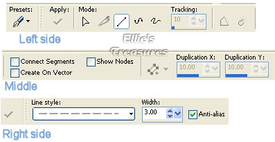
Setting the pen tool
Click on the pen
tool,
Mode: Draw lines and polylines;
Connect segments, Show
nodes and Create on vector all unchecked;
Line style
short dashes (near the bottom of the menu),
width 3, anti-alias
checked.
Everything else left on default.
Zoom the canvas till you can see the border
clearly
(about 150% usually, unless the blinkie is very small).
Make a new layer for each line (you'll be moving them
later).
I used the default line style that comes with PSP to
make the dashed line.
I do find it a bit thick but you can get
other styled lines to add to PSP on the internet.
I have a
large collection of styled lines from "TS" which include many types
of narrower dashed lines.
These lines are from Playful Pixels and
I did a search - the site is no longer available.
My friend Winni
also has Styled Lines on her site, here.
There are many more
sites with Styled Lines and my Great Beginnings page
will have
links to them when I add that section to it.
Lines
for frame 1
~~~~~~~~~~~~~~~~~~~~
If you've come
here directly from just making the grid and aren't adding anything
else to it,
put a dark border around your calendar, about 5-6
pixels wide,
and then continue on with adding the lines as shown
below.
~~~~~~~~~~~~~~~~~~~~~~~
For type 1, the calendar with
no dark border around the canvas, your lines need to be right at the
edges for this method.
For all of the other types, put the
dashes right about the middle of the border.
Make a new raster layer, put your cursor in
the top left corner,
hold the shift key down (which keeps the
line straight), and draw the line down.
Stop at the bottom
corner, Create another new raster layer and draw a line from bottom
left to bottom right. Stop again.
Continue around the blinkie.
Use a contrasting color (either light on dark or dark on light)
or you can color every other dash a different color, such as I
did with the April bunny.
I used the magic wand to pick every
other dash and flood filled them. It doesn't take
long.
If you look at the examples just above, you will see
that the left line starts at the top edge,
bottom starts on left
edge, right starts right at bottom edge, and top line starts right
at right edge.
I recommend you name all of the layers, right,
left, top, bottom
so you can select them easily when it's time
to move them.
Final Edit
Once done putting in your
lines, right click on layer palette on the tube layers and go to
Arrange>Bring to top.
This will put the tube on top of the
blinking line, which looks better
than having the blinking lines
go over top of the tube! LOL
If you want to sharpen or use the
unsharp mask, do it now as well.
If you do it on each frame
separately they will never turn out the same twice
(I know, I
tried - the animation went from sharp to fuzzy to sharp to fuzzy
even though I used the same setting on both frames LOL)
Duplicate canvas and then merge frame 1
If you're
happy with the whole thing, Shift-D to duplicate the canvas while
it's still in layers,
then back to your original canvas, merge
visible (do not flatten, especially if you are using a transparent
canvas
it will lose it's transparency) and save as a psp file
(not pspimage).
In v10, click on save as, pick PSP (Animation
Shop),
in PSP 9, click on save as, click on options, and click
on PSP 7 compatible file,
to save as a .psp file and not a
.pspimage file, and change the .pspimage extension to psp
by
deleting the "image" at the end of the file name before you save.
Animation shop will not recognize pspimage files. Save it as
frame 1.
~~~~~~~~~~~~~~~~
Alternate method: You could
duplicate each layer, hide the new layers by clicking on the eye,
merging visible the rest of them and then name it frame 1 and
saving as Frame 1,
then unhiding the new layers to work on them.
I find just duplicating the canvas much easier and
quicker.
~~~~~~~~~~~~~~~~
Making frame 2
You will now be moving
the lines with the arrow keys on your keyboard, not with your
mouse, for greater precision.
Make sure you do not move anything
else, like the tubes, or they will bounce in the animation.
Click
on the left line layer, and move it so it ends near the bottom edge,
then the bottom line layer and move it so it ends at the right
edge and so on.
You are putting each of those lines in the
opposite position than they were in before.
Frame
1
Frame 2
Merge visible and save this as Frame
2.psp
If you are using the alternate method and keeping all of
this on one canvas,
hide the merged frame 1 layer and merge
visible before saving as Frame 2.
On further experimentation,
I found that 3 frames makes the flow smoother than 2 frames.
If
you want to make 3 frames, just make another one the same way as
frame 2, but in
frame 2 don't move the lines as much and then in
frame 3 move them to their final position.
You're now done
the creation - on to the animation! Very easy. |
| Back to top |
|
ANIMATION |
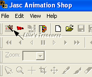
This step is very simple.
Open Animation Shop, click on the top left icon, which is the
animation wizard.
You can also get to it from the file menu.
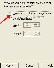
In the first window, click "same size as
the first image frame"
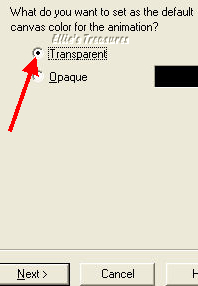
in window 2 pick transparent,
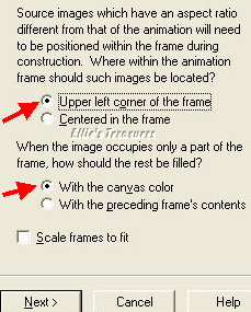
in window 3 leave at default, as upper
left corner of the frame and with the canvas color picked. Do not
pick scale frames.
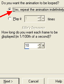
In window 4 pick "yes, repeat
indefinitely" and put 10 in how long.
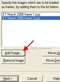
In window 5, you click on "add image" and
add your frame 1 and then your frame 2.
In window 6, click on "finish"
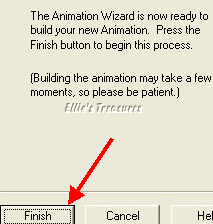
You will see your two frames in the
new window called Animation.
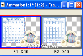
In the top toolbar, click on the far
right icon, just before the help icon, it should be called view
animation.
You will now see your frames combined into an
animation!
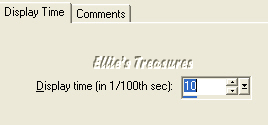
If the timing doesn't seem right, too fast or too
slow, right click on each frame
and click on frame properties,
you can change the display time in there.

Go to File, and click on "Save as" and
save as a gif (gifs are the only picture file formats that are
animated).
In saving, an optimization window will come up.
These calendars are a small file size, so I leave them at Better
image quality, right at the top.
You can change that if you
want. |
That's it, you're now done your
first blinkie calendar.
And if you saved in layers as I showed
you, you will be able to use them as a template to make another
one.
Back
to top |
Here
are a few more examples of my calendars. As you can see, I prefer
the ones on a transparent canvas.
    |
l hope you had fun!
Back
to top |
|
If you have
any questions or suggestions, click on the email button below to
contact me. Have a wonderful day! |
|
|
|
These
tutorials are all my own creations.
Any resemblance to any other
tutorial is purely coincidental and unintentional.
Feel free to
share any of my tutorials on this site by a link back to my site,
but do not copy and send the entire tutorial to anyone or any
group.
©2006 Ellie's Treasures
|
|


| |